Heatmap depicts the two-dimensional data (matrix form) in the form of graph.
Data requirement:
Data can be in the form of:


Data requirement:
Data can be in the form of:
- Matrix such as correlation matrix
- Or a pandas cross tabulated dataframe
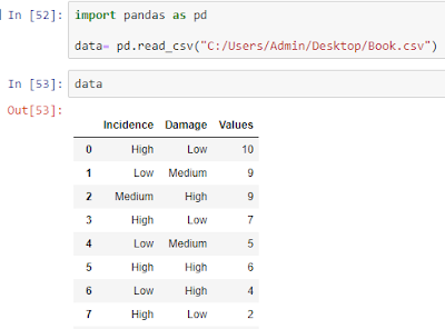
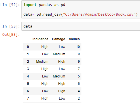
Example:
- Importing the data
- Cross-tabulate the data using pd.crosstab

- Plot the heatmap using seaborn library

- Add linewidths (width of line dividing each cell in the heatmap) and annotate (labeling)

- In this example, we have plotted the heatmap using the frequency of Incidence and damage combinations. Instead of count of incidence and damage class combinations, what if we want to plot the sum of the column 'Values'?
For that, we can use values (which column to use?) and aggfunc (how to aggregate: "sum" or "mean" etc) options in pandas crosstab function.
data3=pd.crosstab(data.Incidence, data.Damage, values=data.Values, aggfunc = "sum")

